Jellyfish OS
A mobile operating system designed for professionals, focused on creating a fluid, personalized experience that is vibrant and easy to use.
Project Deliverables
- Create a unique mobile operating system.
- Establish a design language for the mobile operating system.
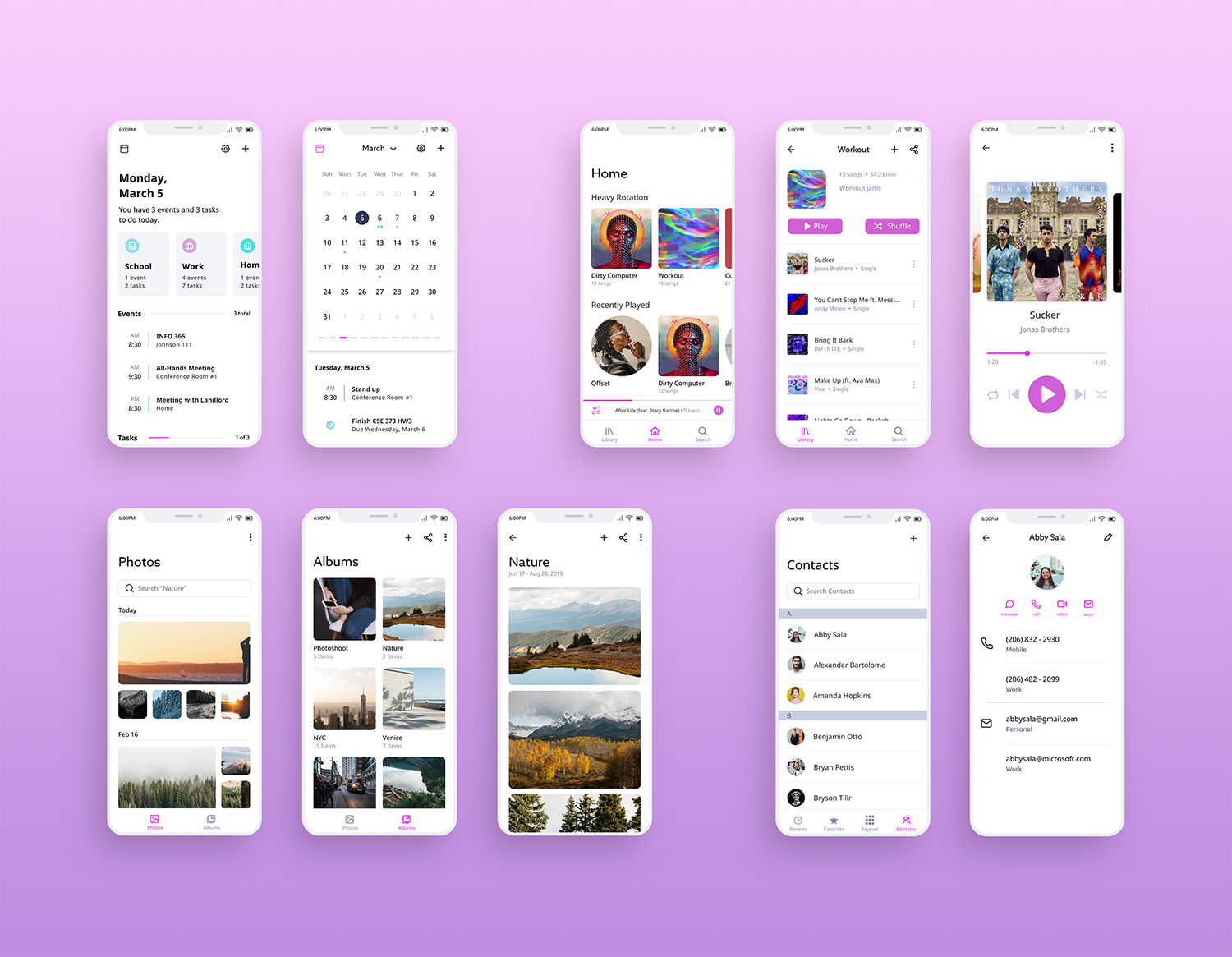
- Create 10 applications using the established design language.
My Role
- UI Animation
- UX/UI design - Messages application
- Icon design and implementation
Project Timeline
- Winter Quarter 2019 - 10 weeks
- INFO 365: Mobile Application Design
Project Overview
The Problem
Our Solution
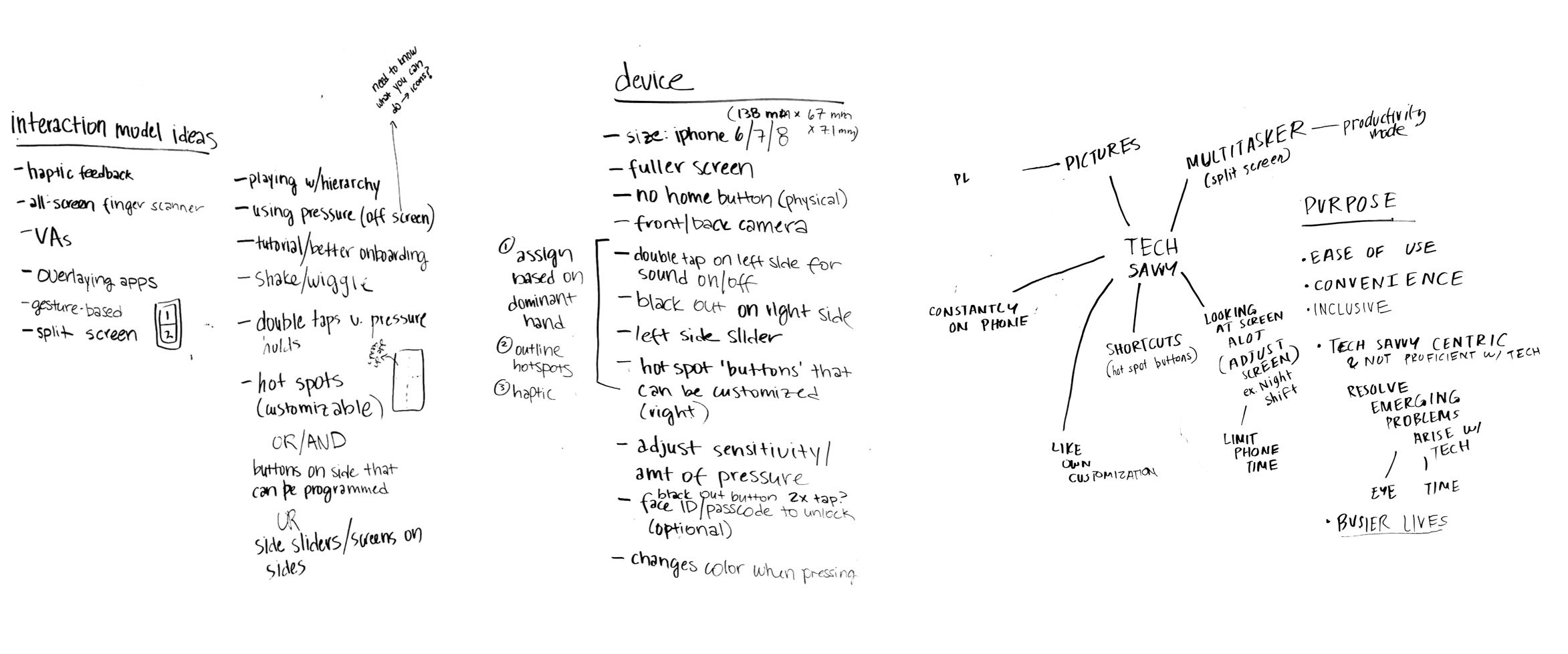
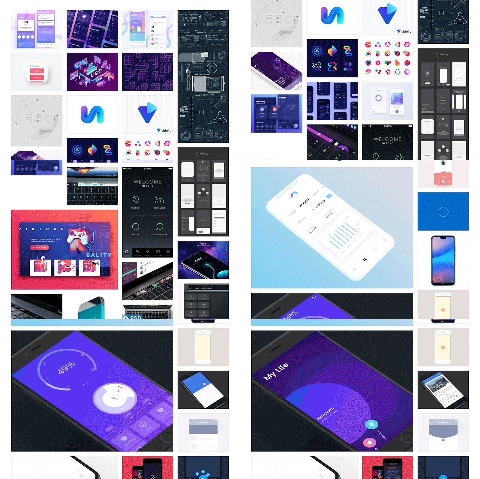 My team started by creating a mood board that conveyed the look and feel of our imagined operating system. Using the mood board as inspiration, we created a design language, for which we came up with six design principles. Our operating system was to be animated, fluid, iridescent, tactile, modern, and personalized. We wanted users to have a smooth, responsive, and enjoyable experience. With these principles in mind, we laid down the ground work for our OS by identifying and creating user journeys, common layouts/design patterns, and interaction design. Once we had this foundation, we designed 10 apps total, presenting our designs once a week and getting feedback from our professor and TA.
My Work
Research and Planning
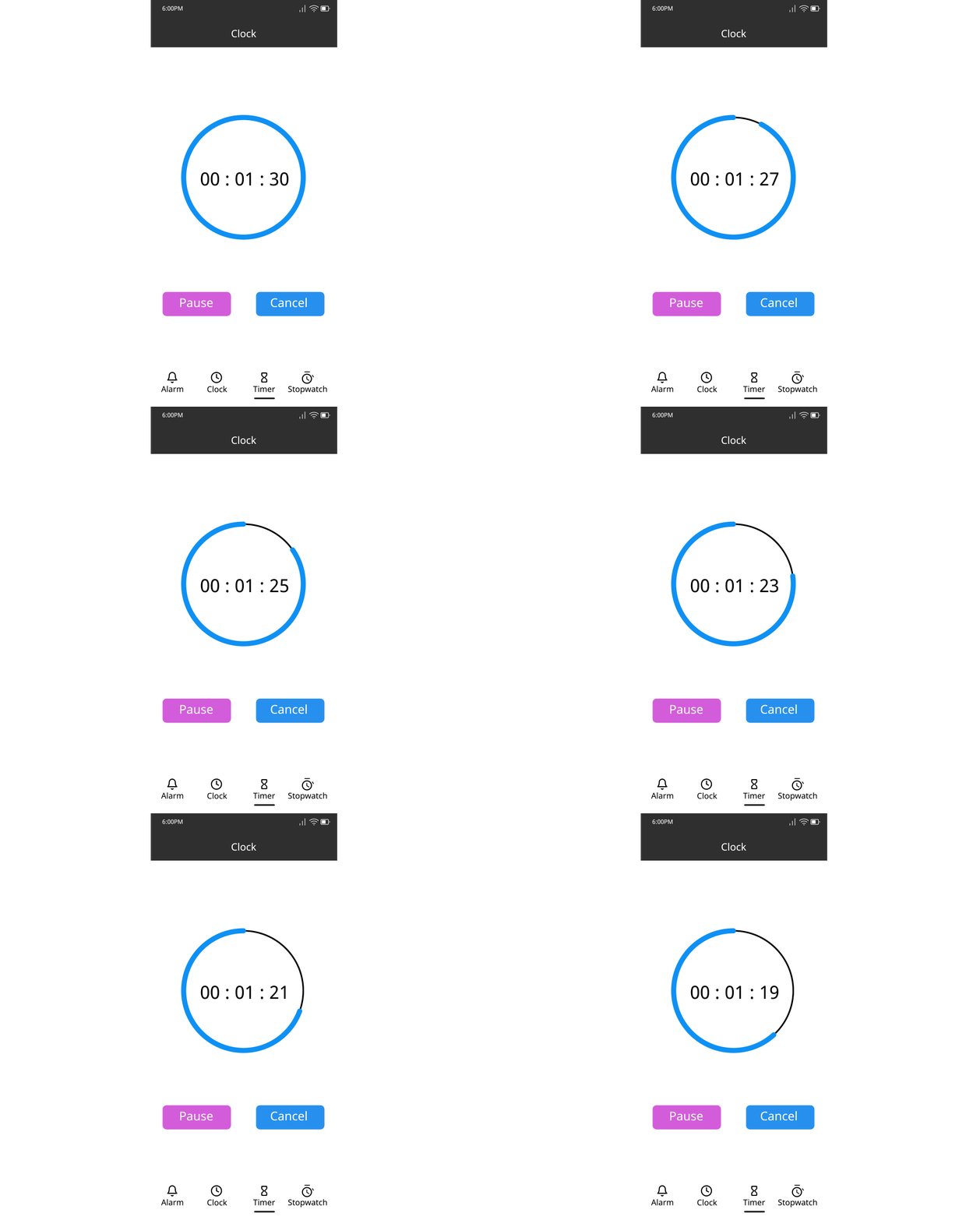
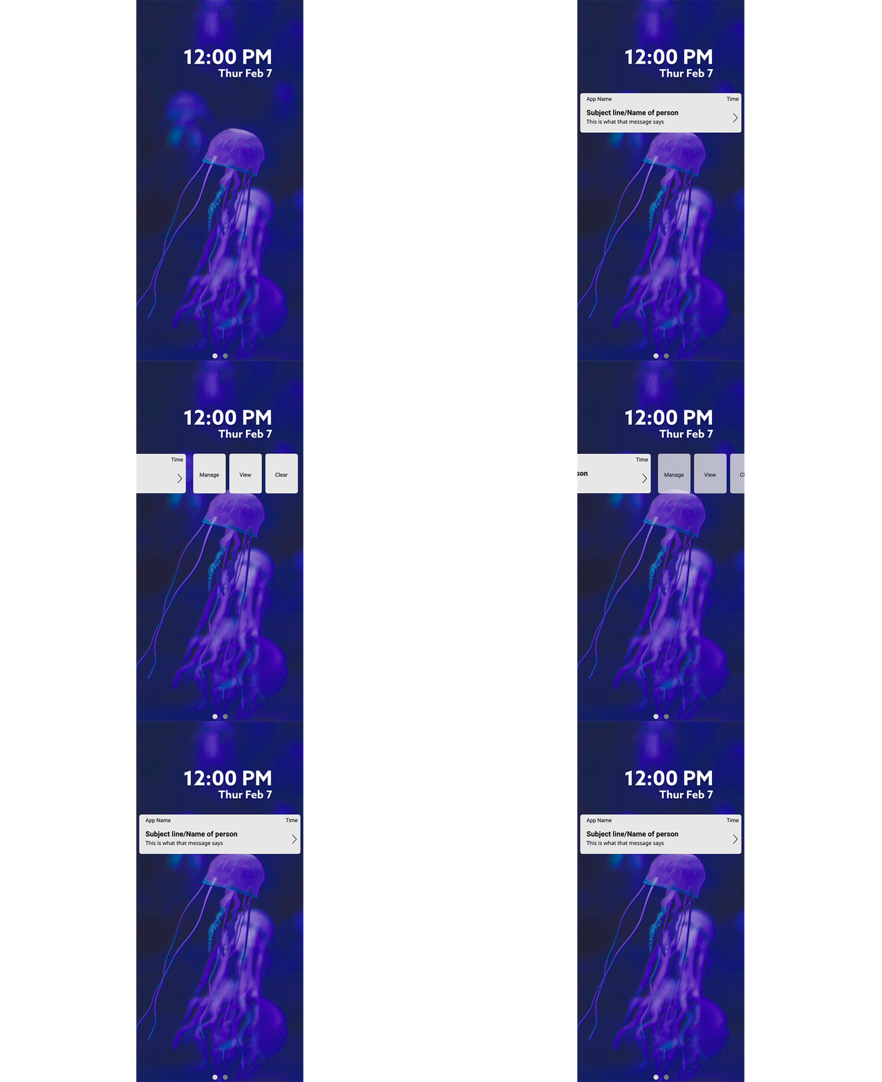
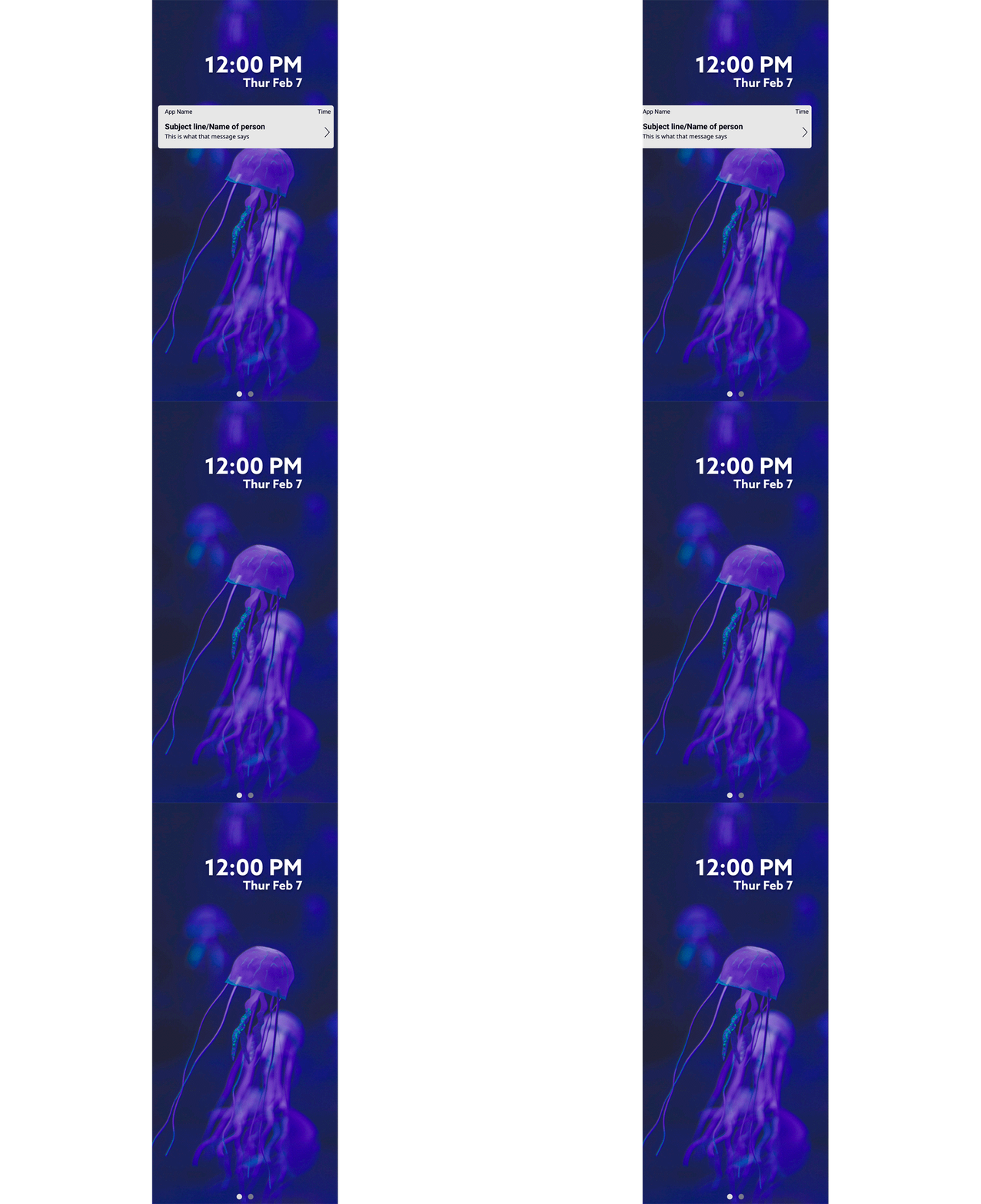
 During our process, we identified animated as one of our design principles. We would later find it too difficult to implement in our final designs, but I was tasked with the job of researching and coming up with UI animation. While I am familiar with 3D character animation, this was my first time attempting UI animation. Using tutorials and example files online, I created these animations in Adobe After Effects.
To the left is my first attempt at line animation in After Effects, and below are the UI animations I created. Interface designs were not done by the team.
Messages App Design
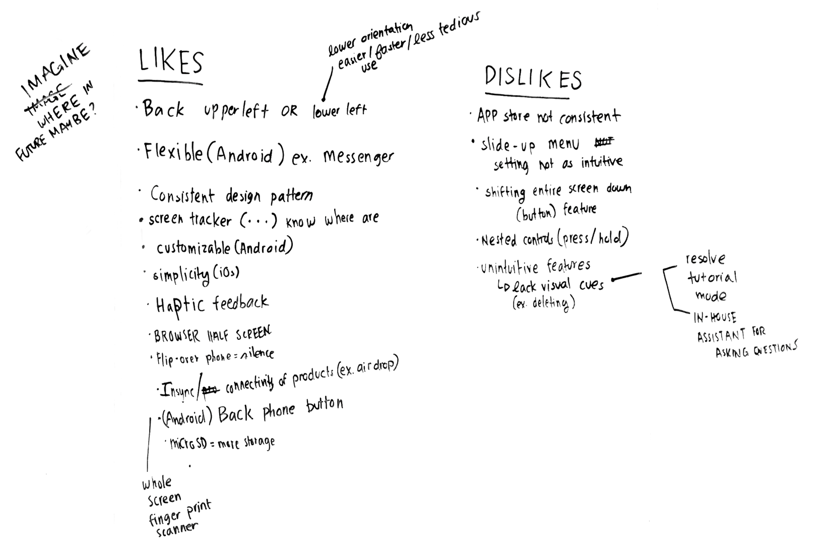
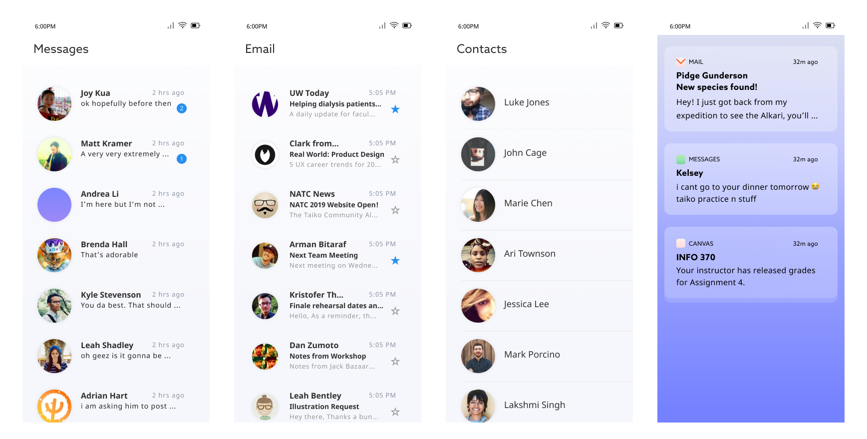
For one of our 10 apps, I created the Messages app. I started out by doing some competitive analysis of other existing messaging apps. I picked out the elements that I liked and disliked, then combined them and made sure they matched our design language.
Competitive Analysis

Initial Designs


Final Designs
When we were near the end of the project, we decided not to finish the Messages app design. However, at that point, we stepped back and realized we had strayed from our established design language and were too focused on existing operating systems like Android and iOS and were emulating them too closely. We made the decision to scrap our previous designs, and I created less extensive versions that better reflected what we wanted for our look and feel.
Icon Library
![]() My biggest contribution to this project was the icon library. In our initial designs, we used icons from various icon libraries that we found online. However, this made visual consistency almost impossible. In order to fix this, I created entirely new icons in Adobe Illustrator, making sure they were stylistically consistent. I ended up making roughly 80 icons, and almost all of the icons used in our final designs were created by me. To the left are most of icons I designed for the project, and below are some of our final screens that show them in use.
My biggest contribution to this project was the icon library. In our initial designs, we used icons from various icon libraries that we found online. However, this made visual consistency almost impossible. In order to fix this, I created entirely new icons in Adobe Illustrator, making sure they were stylistically consistent. I ended up making roughly 80 icons, and almost all of the icons used in our final designs were created by me. To the left are most of icons I designed for the project, and below are some of our final screens that show them in use.


