navU

2019-07-03 00:00:00 +0000
A hybrid schedule and navigation app for new students on campus.
Project Deliverables
- Create a technology based solution that solves an information problem.
- User interface
- Tappable prototype
My Role
- User research
- Persona creation
- UX/UI design
Project Timeline
- Spring Quarter 2017 - 10 weeks
- INFO 200: Intellectual Foundations of Informatics
- Redesign: 2 weeks
Original Project Overview
Problem and Solution
Being a new student at a giant university can be hard. For almost 7,000 new students every year, finding classes on a campus that covers over 700 acres is almost impossible, and discovering available clubs and events can be overwhelming. My teammates and I decided to address both of these problems by creating a navigation app that not only autoloads your schedule and helps you get around campus, but also allows you to discover new clubs and events that are otherwise hard to find.
My Work
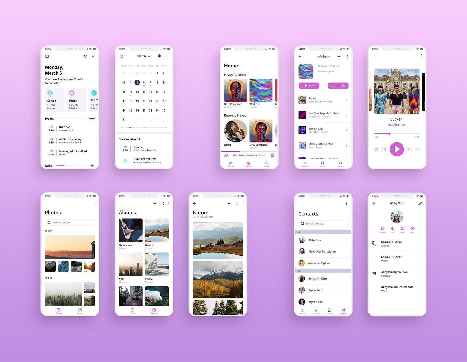
For this project, I conducted user interviews to find out the problems that students faced when they were new on campus, as well as investigate the solutions that students did use. These interviews revealed some major points: campus was huge and hard to get around, finding information about clubs online was nearly impossible, and most students did very little with their between-class downtime. These three takeaways helped us focus the app design.
 Since navigating through campus was such a large issue, we decided to have the app open on the GPS/map function, with directions to the student's next class already loaded. My interviews also led to the discovery that most buildings on campus do not have visible signs, making them hard to identify. So we decided to make the map interactive, letting the user tap on buildings in order to get information. The idea was to create a seamless experience: you could get directions, look at your schedule, find building information, and look for clubs and activities around campus.
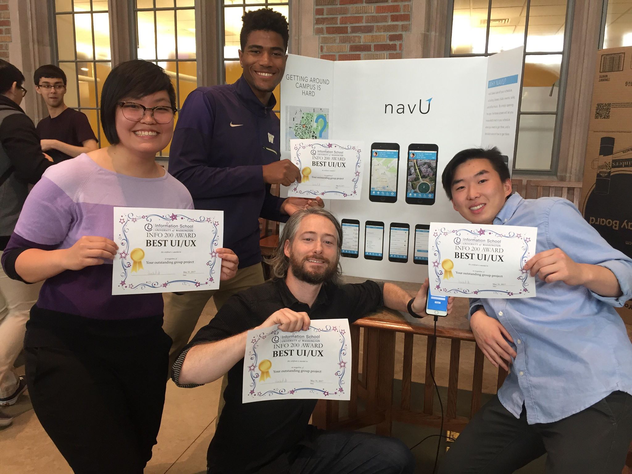
Afer conducting research, I created user personas to help inform our designs. Finally, after another member created our initial paper wireframes, I designed the user interface and screens that would be used in our final prototype. At the INFO 200 project fair, our group won the Best UX/UI Award.

The original screens I designed for my INFO 200 class in 2017.
Redesign Overview
This project made me realize that I could not only do UX/UI design, but that I also really enjoyed it. But looking at it two years later, I knew that I could not only do better, but also that a lot of the app design simply didn't make sense. So I started over, returned to the user interviews that I conducted, and came to new conclusions.
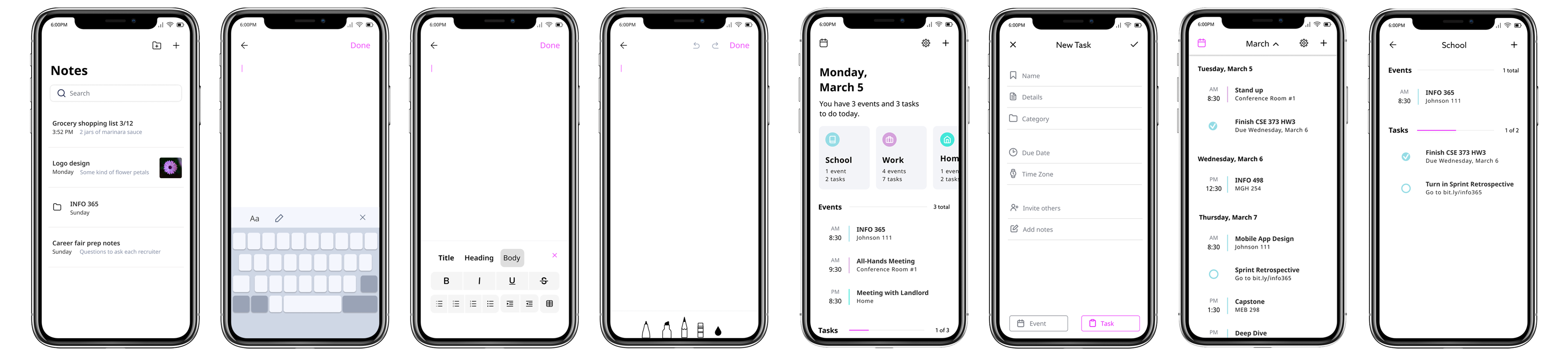
In the previous iteration, we focused on navigation. The app's home page is a map, but not a particularly helpful one: it automatically provides directions to your next class, but offers no way for you to change or cancel them. It was also narrowly focused on new students who were new to campus. What if you were a returning student who just wanted to find out where an obscure building was? What if you wanted directions to get to a club meeting at a building on the outskirts of campus? I knew this was a feature that had to change.

The old map screens don't let you change or cancel directions.
Overall, our app was designed to be a navigational tool that had your schedule, plus a search function to look for clubs and events. When looking over these screens, I saw a lot of rookie design mistakes. Inconsistent font sizes, not enough padding or space, cramming too much information into areas that were too small, not to mention issues with visual hierarchy.

And the schedule itself didn't work particularly well as a schedule. Looking at the schedule at a glance, you can't even tell what time each class is. There's no way to look at different days, to delete events, or to look ahead to the future. To fix this, I looked at a myriad of scheduling apps to see what would work best for a student with a busy schedule.
While rereading the user interviews, I also realized that the biggest problem people faced was finding clubs, a community, and events to go to between classes. So I shifted the app's focus: instead of being a navigation-based app, I decided to create a schedule/event app with navigational capabilities.
Wireframes and Interaction Design


Looking at the previous prototype, I also realized there was no way to get different directions. Your schedule was autoloaded. What about students who already knew where their next class was, but just wanted to look at different routes to get to the library? Or how to get to the student union building? These were things my team and I didn't originally consider, and that I decided to include in my redesign.
Final Design

While redesigning the app, I looked at a lot of different scheduling, calendar, and to-do list apps to get an idea of patterns and trends. Our original schedule design was a list view that didn't seem to be particularly helpful, or a good way to visualize time. I decided to include a week-long calendar view to allow students to look through different days. I also ended up combining the search page with the events page, since having them separate seemed unnecessary.
Final Prototype
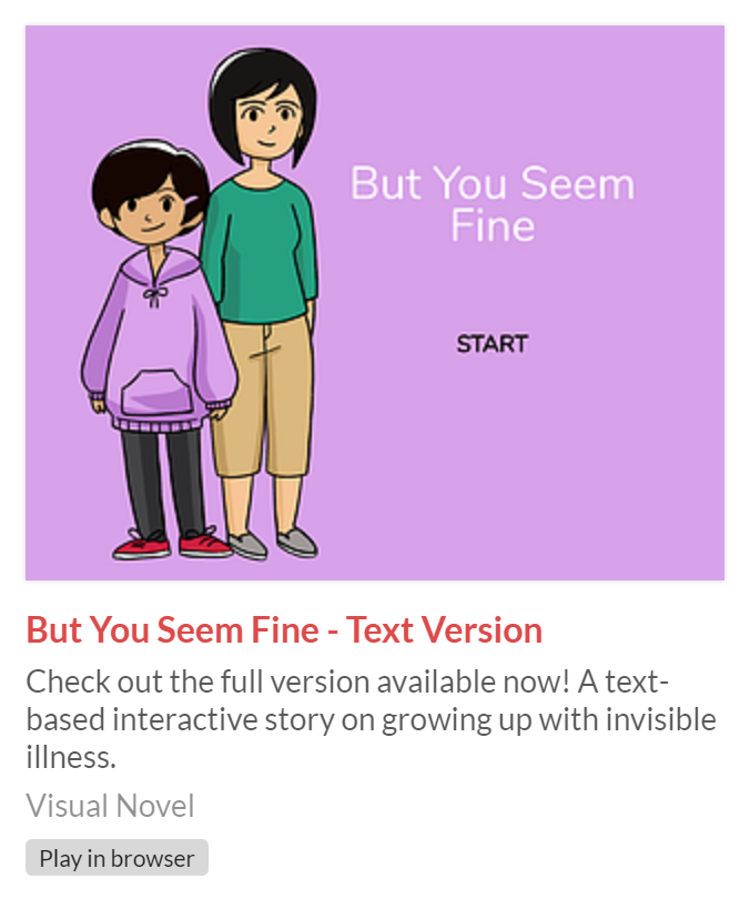
But You Seem Fine
2019-05-26 00:00:00 +0000
An interactive visual story on growing up while navigating the struggles and uncertainties of invisible illness.
Project Deliverables
- Release a minimum viable product (text-based version of the game).
- Publish a fully playable Android app to the Google Play Store.
- Publish a web-based version of the game to Itch.io
My Role
- Artistic Director
- UI Design
- Artist
Project Timeline
- August 2018 - June 2019
- Informatics Capstone Project
Project Overview
The Problem
Invisible illnesses are chronic illnesses that do not present any outwardly identifiable or visible symptoms. This definition is incredibly broad, and applies to diseases from depression and anxiety to fibromyalgia and chronic fatigue syndrome. Because this definition is so broad, it is impossible to precisely know the number of people affected by invisible illness--but the numbers are estimated to be significant.
My capstone team and I discovered three major problems facing this community. First of all, while there are many resources available for adults, there are very few resources available for youth and adolescents. Second, there is very little representation of invisible illness in media, and when it does exist, it is often romanticized and dramatized in ways that are inaccurate and misleading. Lastly, there is a lack of awareness within the broader community about the problems that people with invisible illness face on a daily basis.
Our Solution
In order to address these problems, my capstone group decided to create a video game that follows the journey of a 14-year-old girl who suddenly falls ill and tries to find a diagnosis. We decided on creating a video game for three specific reasions. First, video games are influential. More than 150 million Americans play video games, and 60% of Americans play video games daily. Second, video games are accessible. Android apps can be downloaded anywhere in the world. Because we used Unity for our game, we can also port our game to multiple platforms and languages. Finally, video games are experiential. Video games have a unique ability to foster empathy between the players and characters, making it an ideal platform for us to use.
My Work
Initial Concept and Research
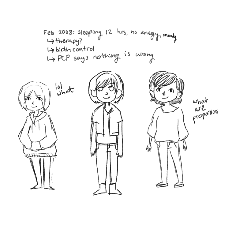
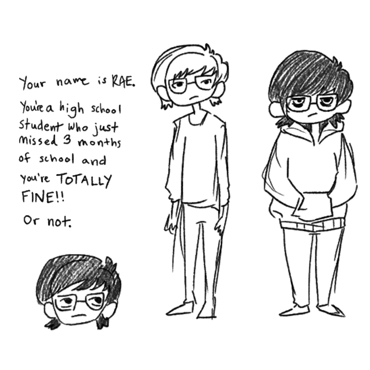 Our group met up at the beginning of fall quarter, knowing only that we wanted to create a game for our senior capstone project. One day, while eating lunch by myself, I was suddenly struck with an idea. About 4 years prior, I had written a single page comic about the time I fell ill during middle school and missed 2 or 3 months of school (in later years, I would be diagnosed with a sleeping disorder, narcolepsy). For some reason, the comic popped up in my mind, and I had an idea: what if I turned that comic into a game? I pulled out my notebook and immediately scribbled the drawing to the left. While I hadn't done any research at the time about the impact of invisible illness, there were two strong reasons why I wanted to pursue this game.
First of all, being a kid dealing with illness was incredibly lonely. I didn't know anyone else my age that was dealing with illness like I was, and the only time I saw illness depicted in media was in medical dramas. Secondly, I knew that it was a story that people would relate to. After presenting my single page comic for class, several classmates came up to me afterwards about how they had experienced the same thing, with a different diagnosis. These were people who didn't feel recognized or seen by mainstream media. My team liked this idea, and after doing some research to back up our claims, we decided to go ahead with this concept.
After coming up with our concept, we needed to lay down the groundwork of what our project would be. As a long time video game fan, I knew that I wanted our game to be a visual novel. This format would work perfectly since our game was so focused on story. Visual novels also allow for the user to make choices, which I also wanted to incorporate. Having to make decisions for the main character makes it easier to empathize and connect with them. Finally, we needed to determine our platform and audience. We decided to focus our audience on a relatively young demographic--ages 10 to 30--both with invisible illness and without it. We wanted to show people with invisible illness a story they could identify with and recognize, but also let those without invisible illness feel the experienc as well. Since our audience was young, we decided to release our game as a mobile application. We chose Android and releasing to the Google Play Store specifically because there are more Android users than there are iPhone users, although we would ideally like to target both platforms. We also decided to release a web-based version of our game in order to give access to people who did not own an Android device.
Story and Preproduction
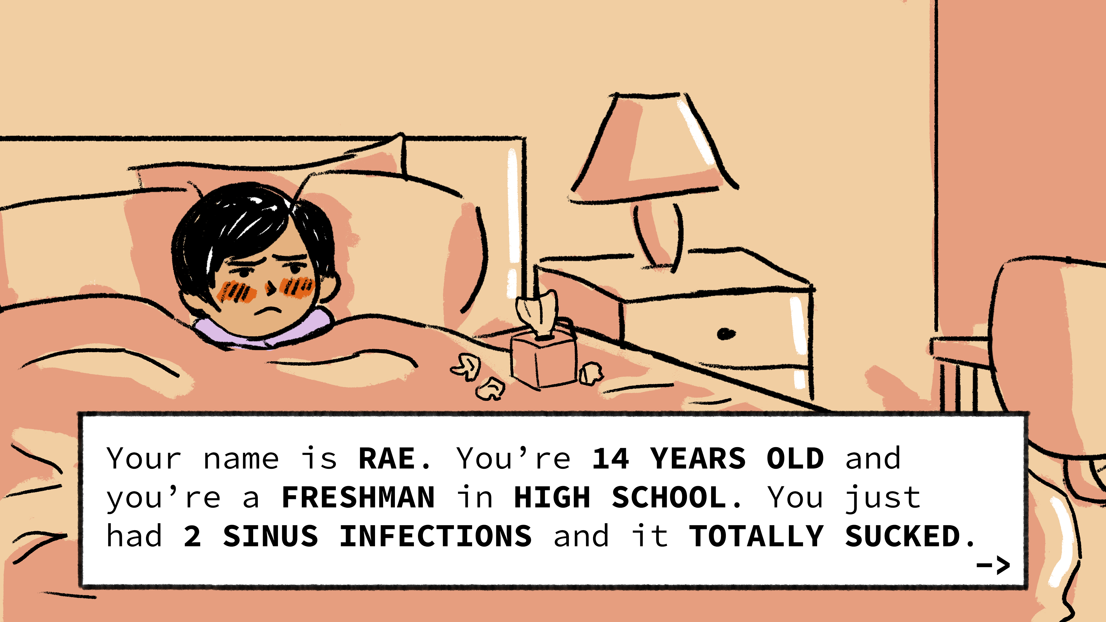
For the rest of winter quarter, we focused on solidifying the game's story and visual style. In its first iteration, my idea for the story revolved around Rae Kim, a high schooler who was just diagnosed with narcolepsy. My idea was to focus on how her invisible illness affected her daily life.
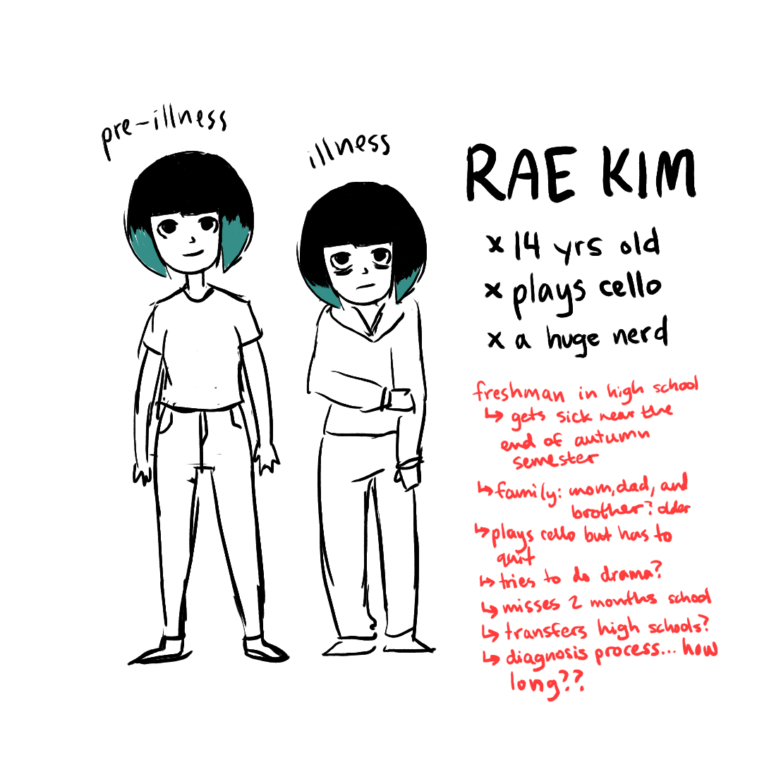
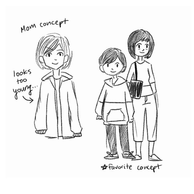
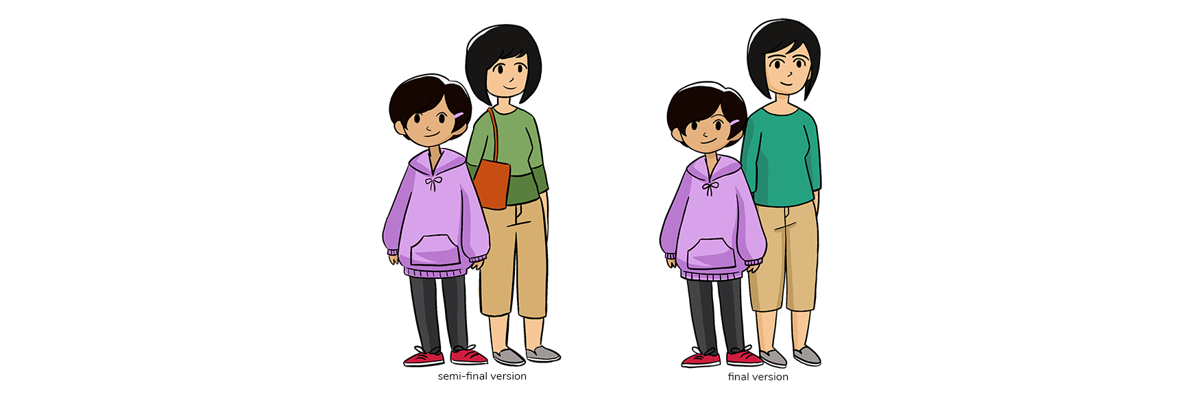
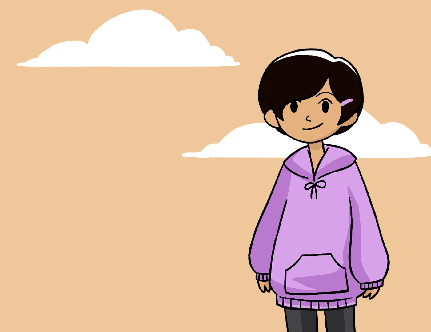
The main character, Rae, went through many iterations before we settled on a final design.
Although this was the initial idea, we felt as though not including the diagnosis process would make the story harder to relate to. We talked about how the comic I had made originally resonated with so many people specifically because there are so many similarities in people's stories when it comes to looking for doctors and the right diagnosis. Therefore, we decided to pivot. Instead of starting the story after Rae's diagnosis, the story would begin as she started her first semester of high school and follow her journey as she became mysteriously ill.
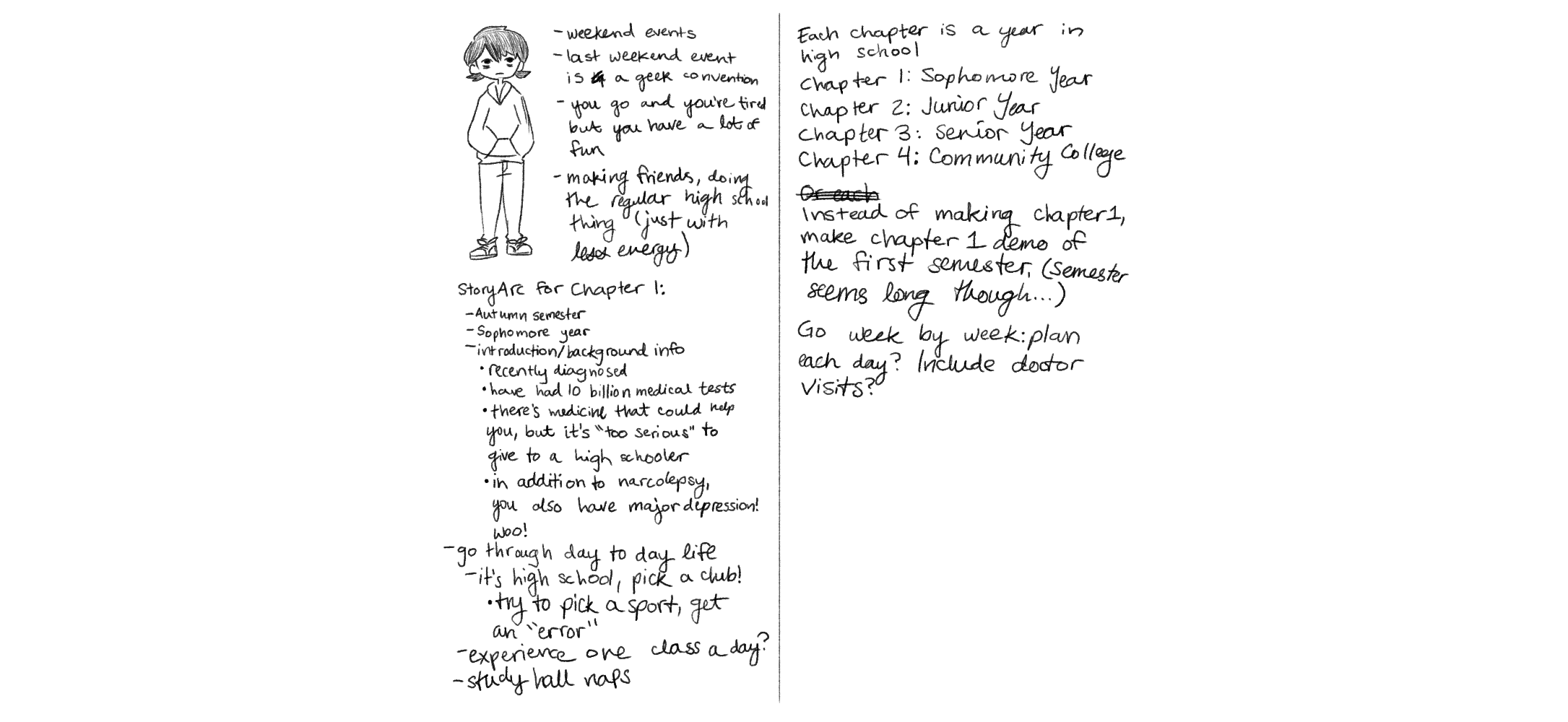
My initial story outline, before we changed it.
There were a lot of difficulties to this process. I am the only member of our group who has an invisible illness, so the group depended on my experience in order to tell an accurate story. I was charged with writing the outline for our game since I was most familiar with the process. To do this, I wrote down the chronological events of everything that had happened during middle school. This was much harder than I anticipated because it was so very personal.
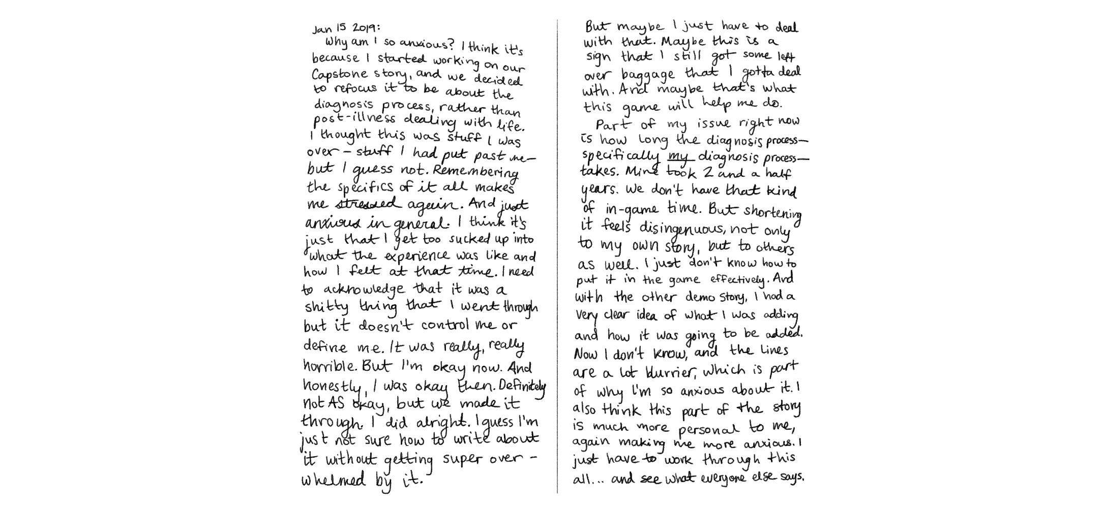
Reliving the diagnosis process was difficult and required a lot of personal analysis on my part.
Bringing up my struggles with the team helped me get through this process, and I was able to create an outline without too much trouble. I handed this outline off to my teammate Maddie, who then wrote the first draft of the game's script. Once she finished the first draft, I edited it, focusing on accuracy and grammar. After several rounds of edits and proofreads, we finished the script.
Minimum Viable Product and Feedback
After finishing the script, we focused on creating our final deliverable for winter quarter: our minimum viable product. We decided early on that our MVP would be a text-based version of our game with no visuals. We chose to use an open source text engine called Twine, which let us import our script and have the base functionality of a visual novel: make choices and get to different endings. After successfully porting our script to Twine, we published our game to Itch.io and sent out a Google form for feedback.
Over spring break, we received 9 responses to our Google Form, with plenty of feedback. We learned several key things from this feedback. One, it was hard to feel the passage of time when Rae was visiting doctors. Two, users didn't feel an immediate impact when they made choices. Three, some of our endings seemed unfair. Working with this feedback, we spent a week rewriting the script and story. The major changes we made were to include transition screens to let the user know how much time had passed, adding more events in between doctors' visits, and changing how the stats that determined our endings were distributed.
Concepts I created when the game was still just in text form.
Transition to Unity
After updating our script, we were off to the races, scrambling to import our existing game into Unity. One of our team members tried to code our game using just Unity, but because we had such a short timeline (9 weeks not counting the week changing the script), we opted to use a third party package called Visual Novel Engine. This engine was vital to our success and saved us much of time in the development process.
While my teammates were importing the script into Unity, I focused on drawing all the character emotions that we would need later on in the process. To do this, I read the script and marked the places I thought needed an expression, writing down the emotion. I then sketched, inked, and colored these emotions for the three main characters (Rae, her mom, and her best friend Sadie).
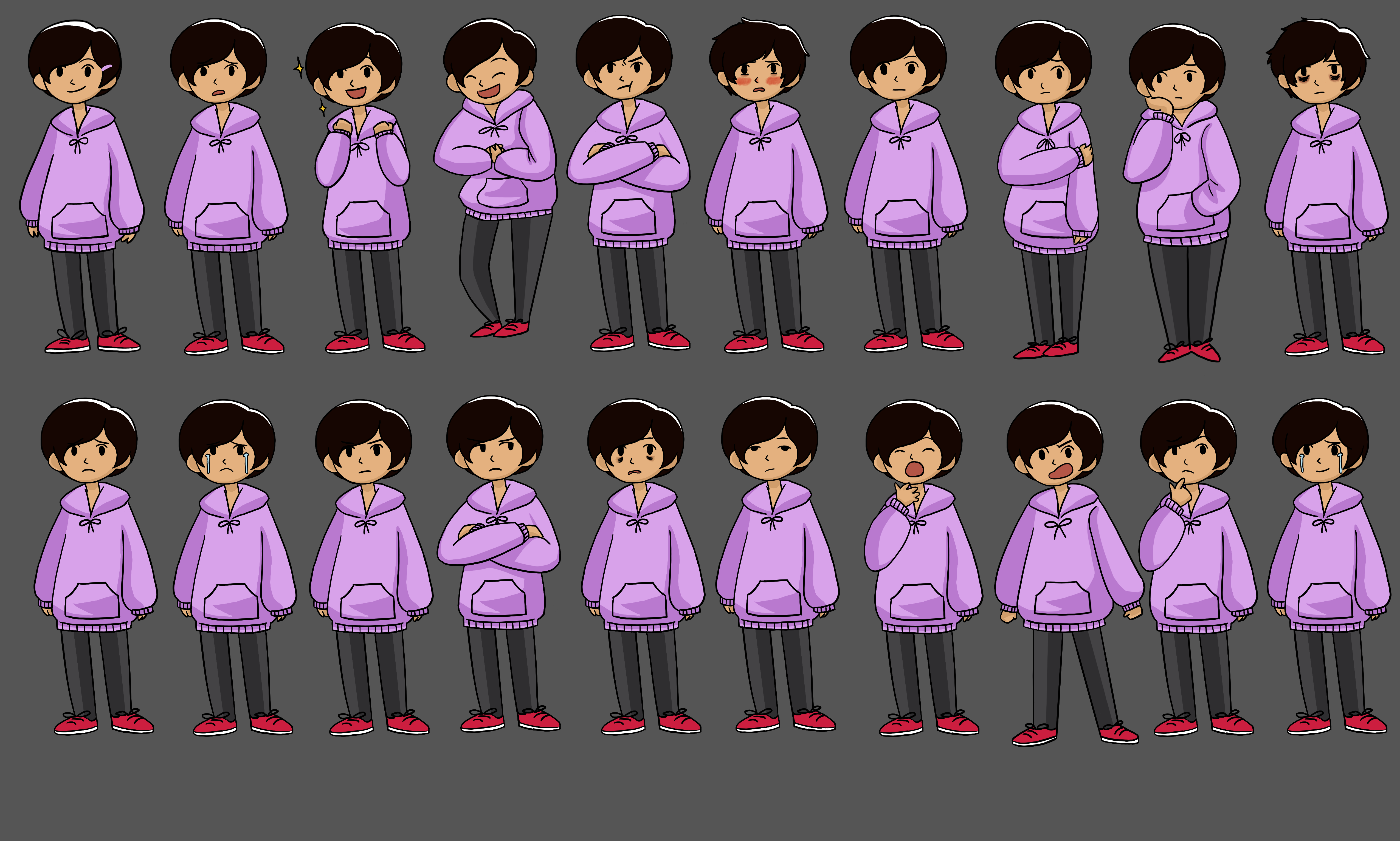
After finishing these character emotions, I then imported all the sprites to the game and implemented each emotion change. During this process, I quickly realized that the 20 emotions I started with would not be nearly enough. I ended up creating 112 sprites total: 50 emotions for Rae, 28 for her mom, and 34 for her best friend.
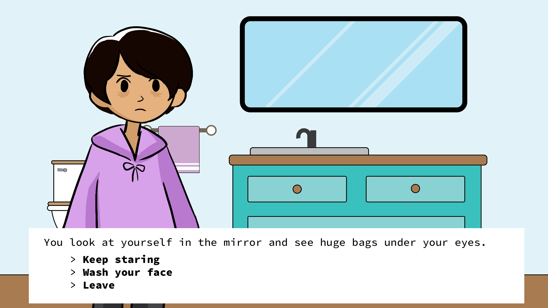
Once I was finished with implementing the character emotions, I finished designing and creating the textures for the user interface. As a team, we felt that the UI that came with Visual Novel Engine was clunky, unappealing, and hard to understand. After testing different UI on my phone using Figma, I created the new textures to make our UI both more aesthetically pleasing and easier to understand.
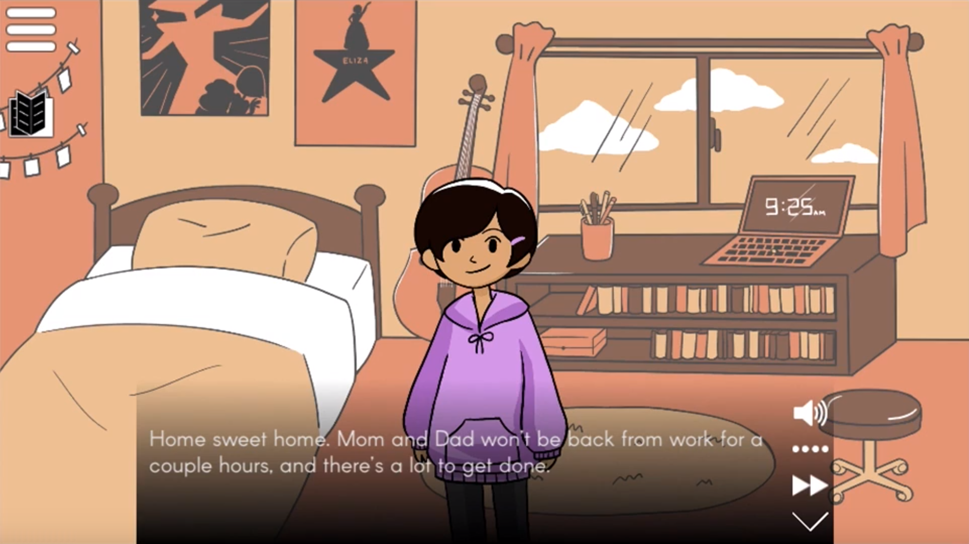
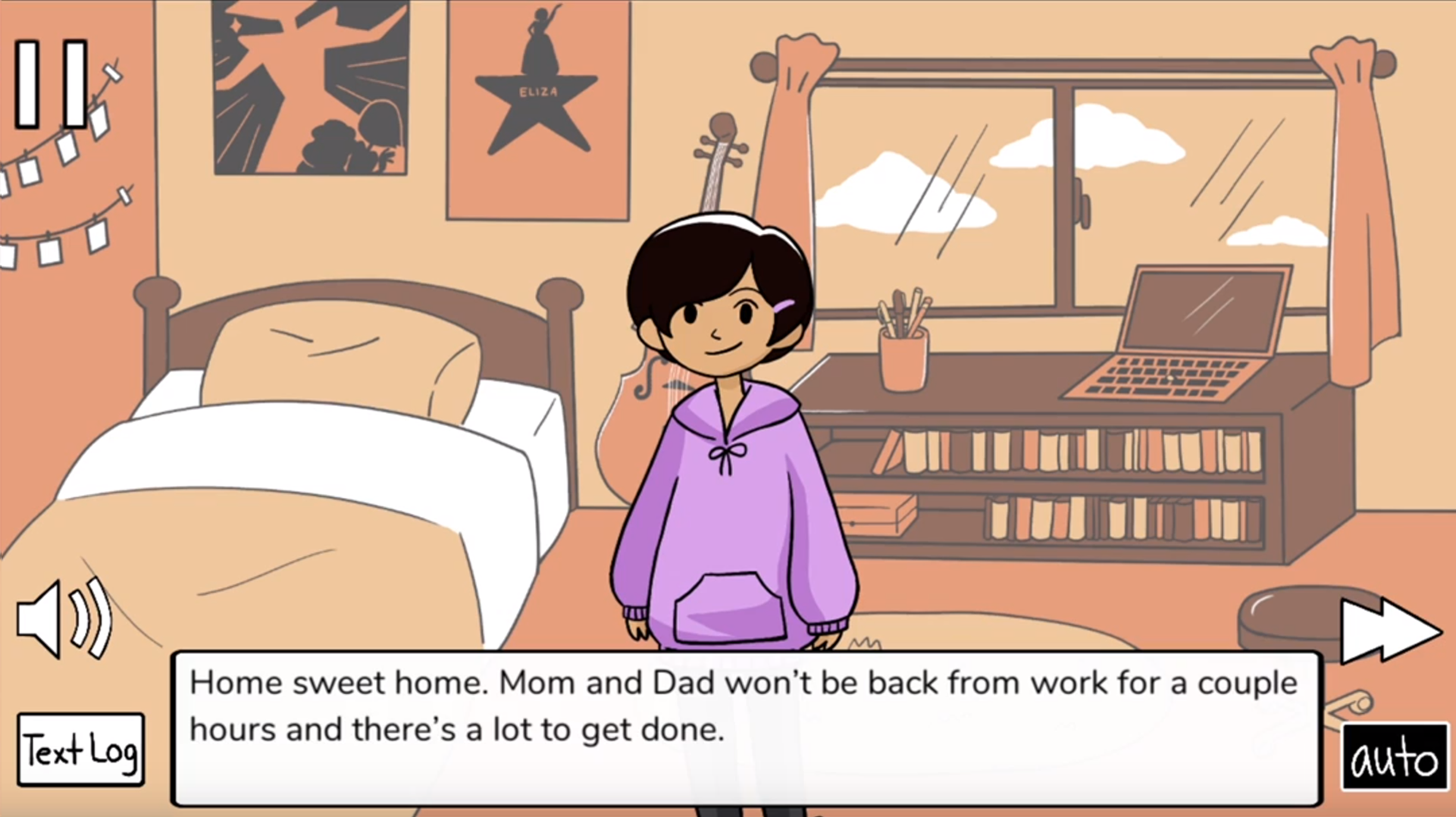
The UI as it originally appeared in Visual Novel Engine versus the UI I designed.
After the UI and emotions were done, we focused on proofreading the game and making sure there were no bugs or errors. We also started creating test APKs so we could play through the game on our phones and do user testing. As we started preparing our release to the Google Play Store, I also created the game's title menu, app icon, and promotional banners and graphics. Once these were completed, my teammates Joy and Maddie published our game to the Google Play Store and Itch.io.
Results
We published our game to both the Google Play Store and Itch.io on May 12th, 2019. Since then, we have received an amazing amount of feedback and so much more attention than we ever imagined. On Itch.io, we've received almost 6,000 views and roughly 3,000 plays of the game.
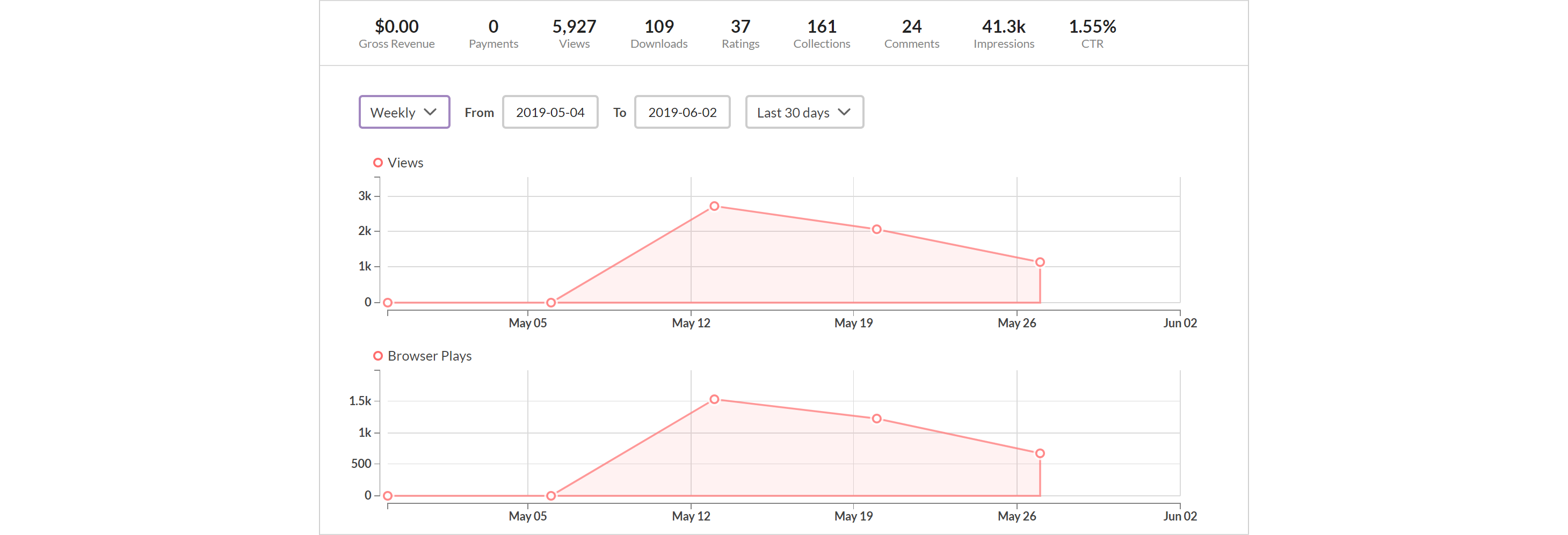
The analytics of our game as of June 2nd, 2019.
But the best part of it all has been the comments. Before releasing the game, I was definitely nervous about publishing what was essentially my life story for anyone to open up and see. I didn't know if it would make an impact. But we've received dozens of comments since releasing our game, and they have validated the fact that this is a story that needed to be told and has touched many people.
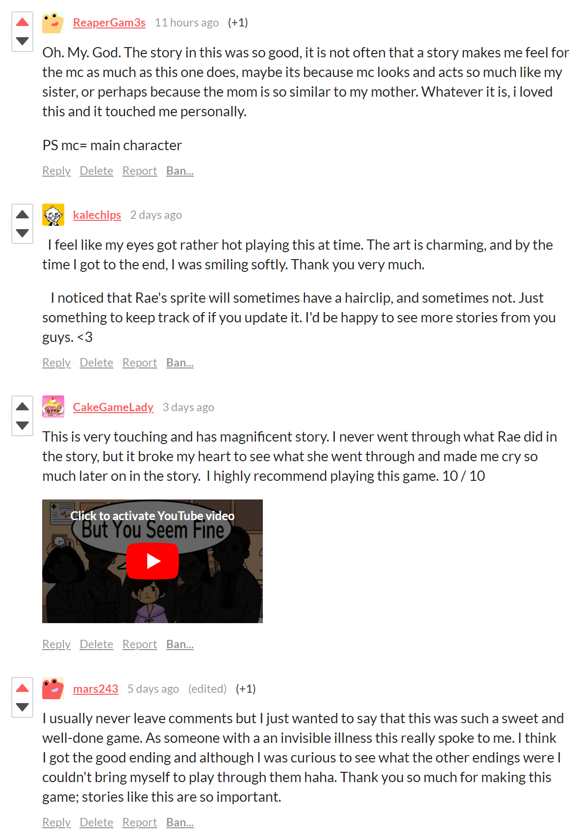
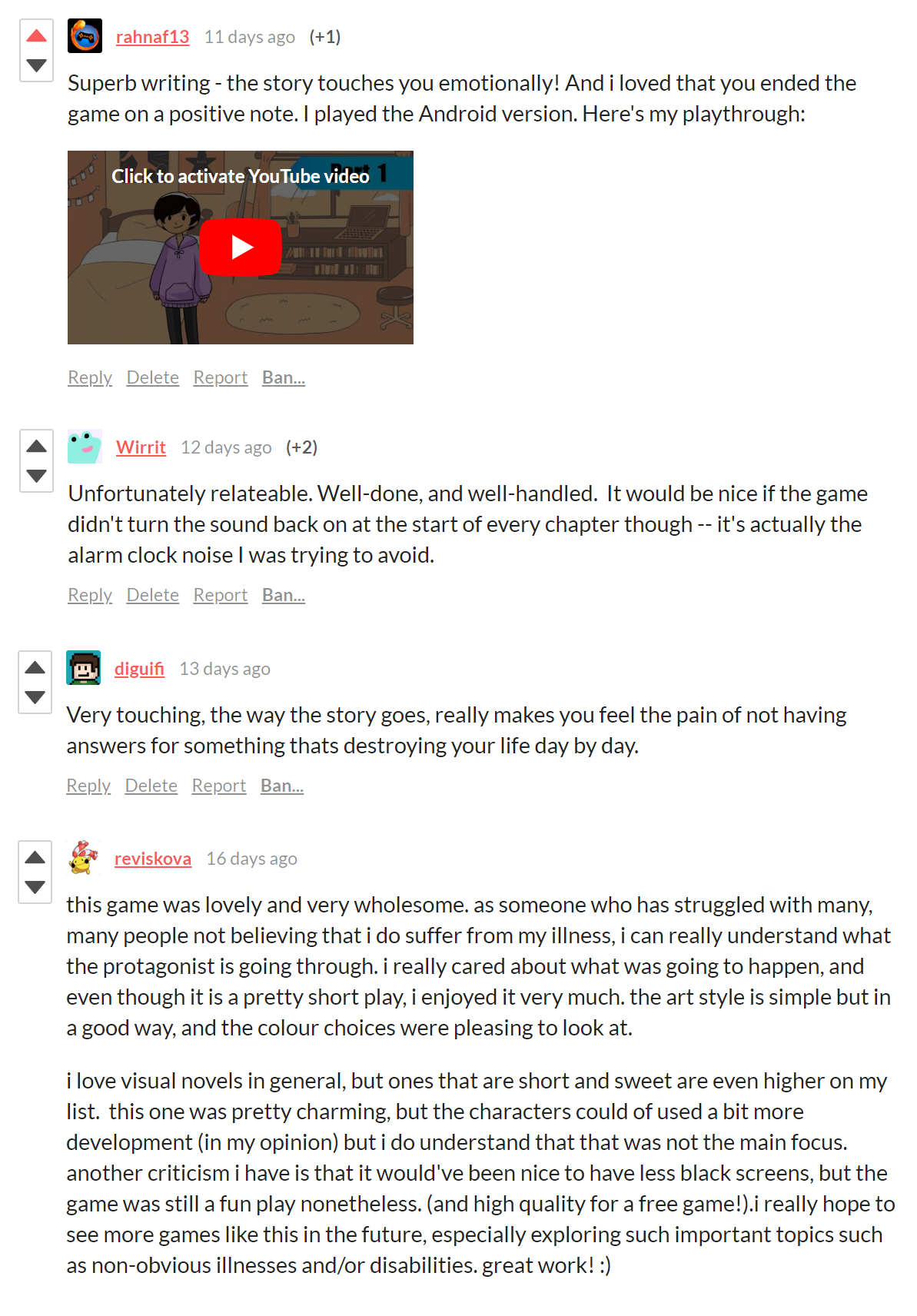
Comments on our Itch.io.
Takeaways
The scope of this project was monumental, and its timeline was incredibly short for the amount of work we had to do. I learned that it is so very important to realistically evaluate your project timeline. Because we did this, we were able to utilize external resources in order to not only finish our game, but also release it to multiple platforms.
This project allowed me to work with a small team for a long period of time--much longer than other class projects, especially since the UW runs on the quarter system. Sticking with the same team meant conflict and friction between team members was bound to happen, but I learned how to resolve issues with practical solutions that helped everyone feel acknowledged and heard.
Finally, being the driving force of a project is intimidating, but richly rewarding. I also had to realize that my priorities for the project were different than others, and learned how to adjust. Taking initiative at the beginning of our project has led to so much growth, both personal and professional.
Jellyfish OS
2019-03-15 00:00:00 +0000
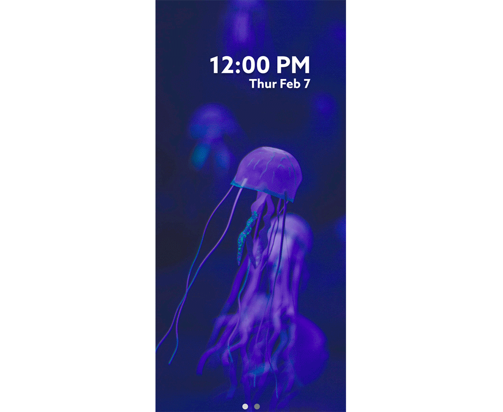
A mobile operating system designed for professionals, focused on creating a fluid, personalized experience that is vibrant and easy to use.
Project Deliverables
- Create a unique mobile operating system.
- Establish a design language for the mobile operating system.
- Create 10 applications using the established design language.
My Role
- UI Animation
- UX/UI design - Messages application
- Icon design and implementation
Project Timeline
- Winter Quarter 2019 - 10 weeks
- INFO 365: Mobile Application Design
Project Overview
The Problem
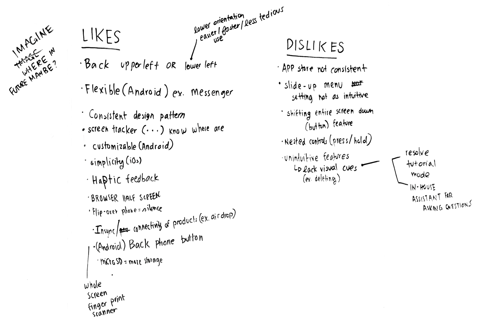 What makes a great mobile phone? Why do people choose and stick to certain operating systems, like Android or iPhone? These were the types of questions my group asked as we tackled creating a brand new mobile operating system. We went deep into the nitty gritty of what we liked and disliked about current devices and began brainstorming ideas for a new device of our own. Since we were creating something entirely new, we decided to focus on an audience of young, tech-savvy professionals. As we narrowed this down, we found a few key aspects to focus in on: personalization and ease of use.
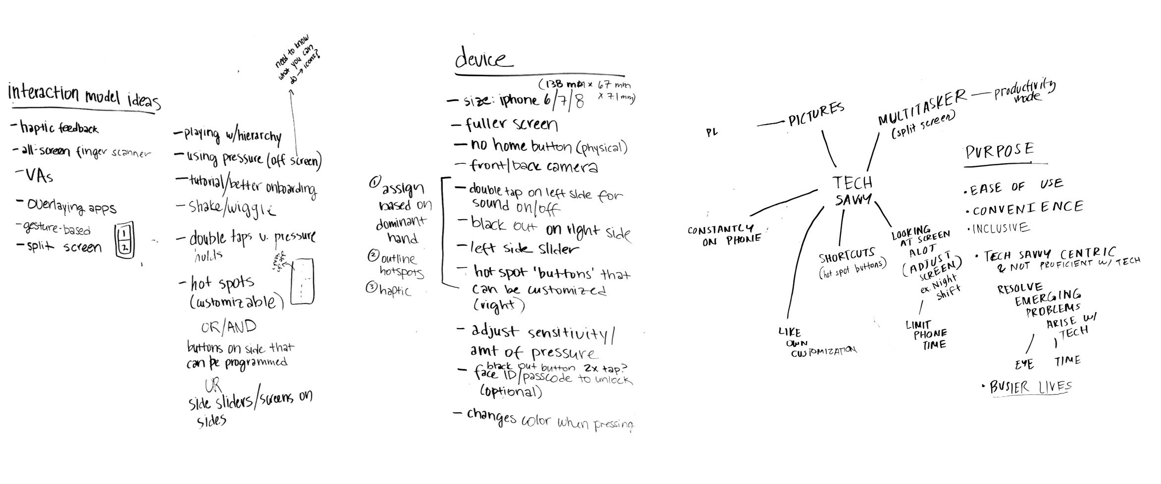
Our Solution
 My team started by creating a mood board that conveyed the look and feel of our imagined operating system. Using the mood board as inspiration, we created a design language, for which we came up with six design principles. Our operating system was to be animated, fluid, iridescent, tactile, modern, and personalized. We wanted users to have a smooth, responsive, and enjoyable experience. With these principles in mind, we laid down the ground work for our OS by identifying and creating user journeys, common layouts/design patterns, and interaction design. Once we had this foundation, we designed 10 apps total, presenting our designs once a week and getting feedback from our professor and TA.
My Work
Research and Planning
 During our process, we identified animated as one of our design principles. We would later find it too difficult to implement in our final designs, but I was tasked with the job of researching and coming up with UI animation. While I am familiar with 3D character animation, this was my first time attempting UI animation. Using tutorials and example files online, I created these animations in Adobe After Effects.
To the left is my first attempt at line animation in After Effects, and below are the UI animations I created. Interface designs were not done by the team.
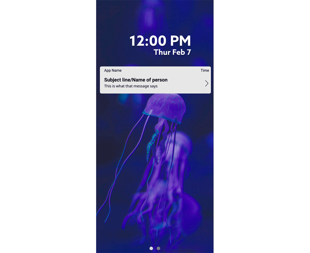
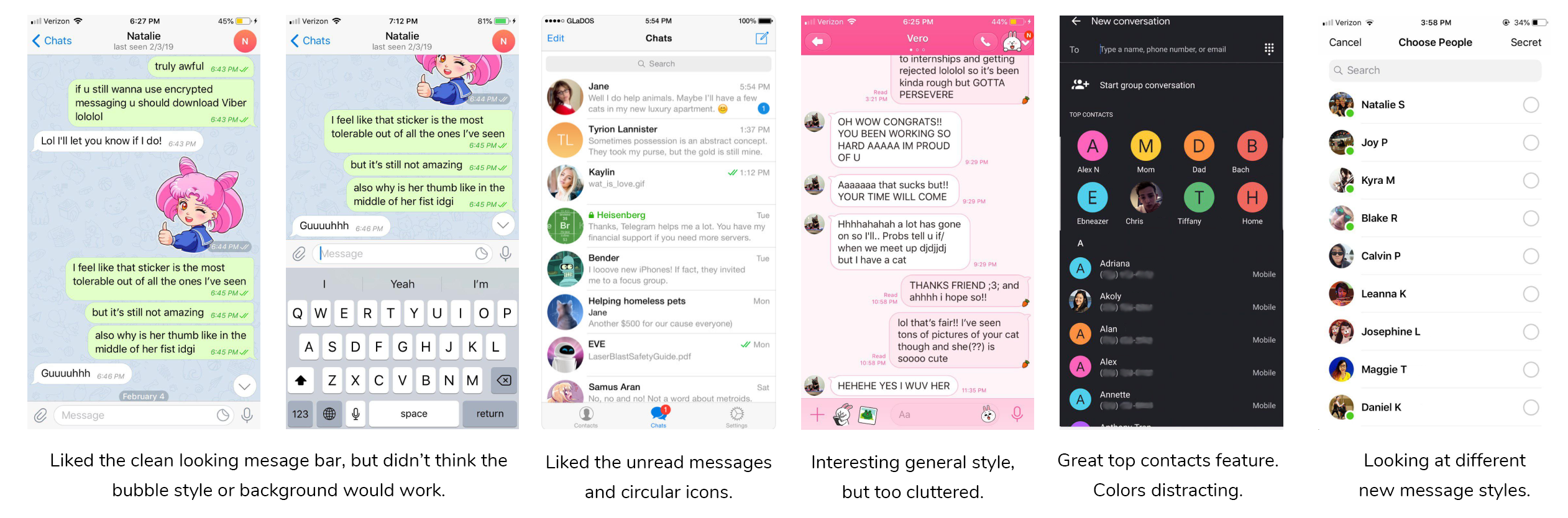
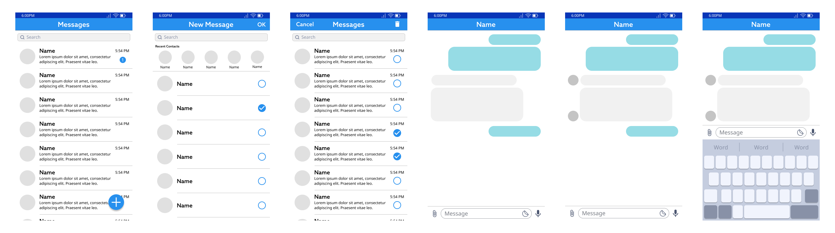
Messages App Design
For one of our 10 apps, I created the Messages app. I started out by doing some competitive analysis of other existing messaging apps. I picked out the elements that I liked and disliked, then combined them and made sure they matched our design language.
Competitive Analysis
Initial Designs
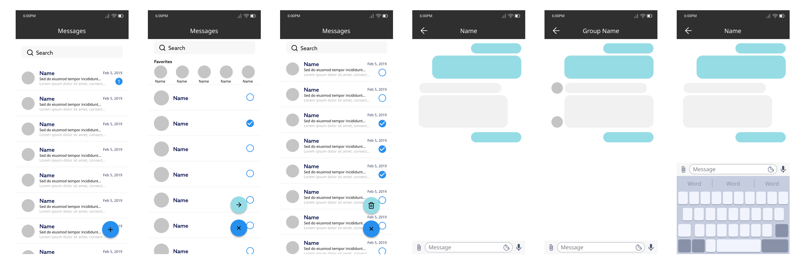
Final Designs
When we were near the end of the project, we decided not to finish the Messages app design. However, at that point, we stepped back and realized we had strayed from our established design language and were too focused on existing operating systems like Android and iOS and were emulating them too closely. We made the decision to scrap our previous designs, and I created less extensive versions that better reflected what we wanted for our look and feel.
Icon Library
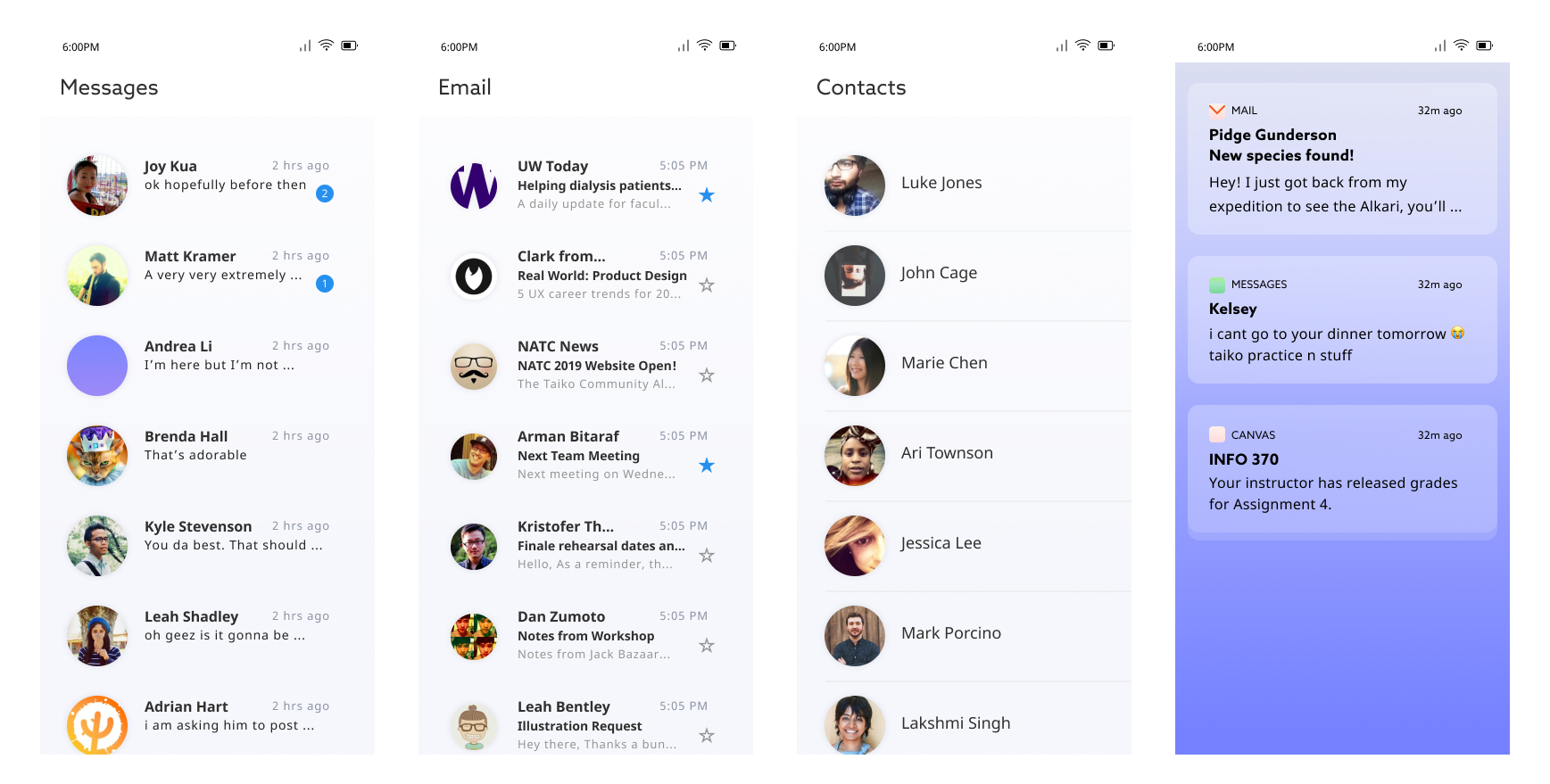
![]() My biggest contribution to this project was the icon library. In our initial designs, we used icons from various icon libraries that we found online. However, this made visual consistency almost impossible. In order to fix this, I created entirely new icons in Adobe Illustrator, making sure they were stylistically consistent. I ended up making roughly 80 icons, and almost all of the icons used in our final designs were created by me. To the left are most of icons I designed for the project, and below are some of our final screens that show them in use.
My biggest contribution to this project was the icon library. In our initial designs, we used icons from various icon libraries that we found online. However, this made visual consistency almost impossible. In order to fix this, I created entirely new icons in Adobe Illustrator, making sure they were stylistically consistent. I ended up making roughly 80 icons, and almost all of the icons used in our final designs were created by me. To the left are most of icons I designed for the project, and below are some of our final screens that show them in use.