navU

A hybrid schedule and navigation app for new students on campus.
Project Deliverables
- Create a technology based solution that solves an information problem.
- User interface
- Tappable prototype
My Role
- User research
- Persona creation
- UX/UI design
Project Timeline
- Spring Quarter 2017 - 10 weeks
- INFO 200: Intellectual Foundations of Informatics
- Redesign: 2 weeks
Original Project Overview
Problem and Solution
Being a new student at a giant university can be hard. For almost 7,000 new students every year, finding classes on a campus that covers over 700 acres is almost impossible, and discovering available clubs and events can be overwhelming. My teammates and I decided to address both of these problems by creating a navigation app that not only autoloads your schedule and helps you get around campus, but also allows you to discover new clubs and events that are otherwise hard to find.
My Work
For this project, I conducted user interviews to find out the problems that students faced when they were new on campus, as well as investigate the solutions that students did use. These interviews revealed some major points: campus was huge and hard to get around, finding information about clubs online was nearly impossible, and most students did very little with their between-class downtime. These three takeaways helped us focus the app design.
 Since navigating through campus was such a large issue, we decided to have the app open on the GPS/map function, with directions to the student's next class already loaded. My interviews also led to the discovery that most buildings on campus do not have visible signs, making them hard to identify. So we decided to make the map interactive, letting the user tap on buildings in order to get information. The idea was to create a seamless experience: you could get directions, look at your schedule, find building information, and look for clubs and activities around campus.
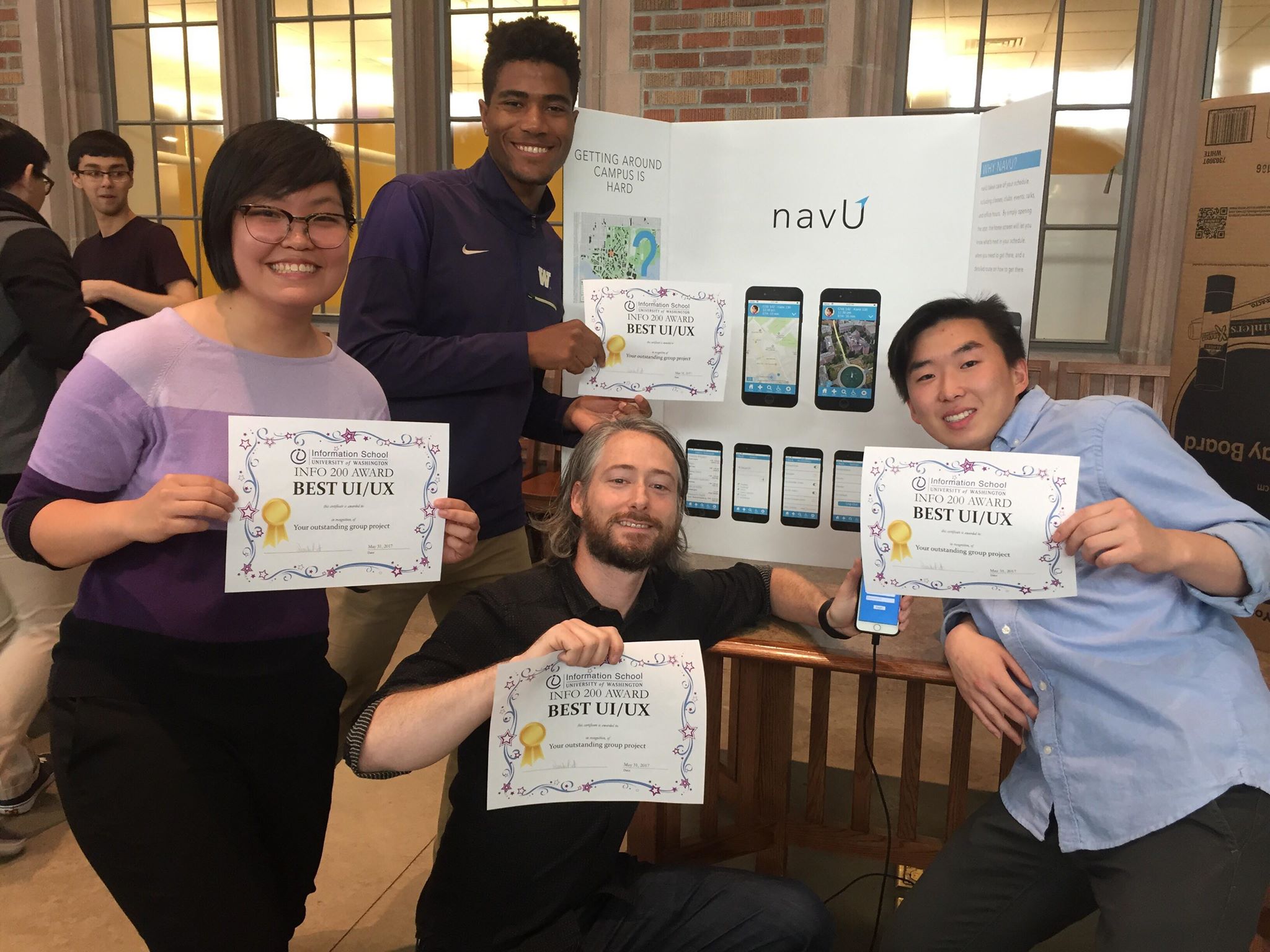
Afer conducting research, I created user personas to help inform our designs. Finally, after another member created our initial paper wireframes, I designed the user interface and screens that would be used in our final prototype. At the INFO 200 project fair, our group won the Best UX/UI Award.

The original screens I designed for my INFO 200 class in 2017.
Redesign Overview
This project made me realize that I could not only do UX/UI design, but that I also really enjoyed it. But looking at it two years later, I knew that I could not only do better, but also that a lot of the app design simply didn't make sense. So I started over, returned to the user interviews that I conducted, and came to new conclusions.
In the previous iteration, we focused on navigation. The app's home page is a map, but not a particularly helpful one: it automatically provides directions to your next class, but offers no way for you to change or cancel them. It was also narrowly focused on new students who were new to campus. What if you were a returning student who just wanted to find out where an obscure building was? What if you wanted directions to get to a club meeting at a building on the outskirts of campus? I knew this was a feature that had to change.

The old map screens don't let you change or cancel directions.
Overall, our app was designed to be a navigational tool that had your schedule, plus a search function to look for clubs and events. When looking over these screens, I saw a lot of rookie design mistakes. Inconsistent font sizes, not enough padding or space, cramming too much information into areas that were too small, not to mention issues with visual hierarchy.

And the schedule itself didn't work particularly well as a schedule. Looking at the schedule at a glance, you can't even tell what time each class is. There's no way to look at different days, to delete events, or to look ahead to the future. To fix this, I looked at a myriad of scheduling apps to see what would work best for a student with a busy schedule.
While rereading the user interviews, I also realized that the biggest problem people faced was finding clubs, a community, and events to go to between classes. So I shifted the app's focus: instead of being a navigation-based app, I decided to create a schedule/event app with navigational capabilities.
Wireframes and Interaction Design


Looking at the previous prototype, I also realized there was no way to get different directions. Your schedule was autoloaded. What about students who already knew where their next class was, but just wanted to look at different routes to get to the library? Or how to get to the student union building? These were things my team and I didn't originally consider, and that I decided to include in my redesign.
Final Design

While redesigning the app, I looked at a lot of different scheduling, calendar, and to-do list apps to get an idea of patterns and trends. Our original schedule design was a list view that didn't seem to be particularly helpful, or a good way to visualize time. I decided to include a week-long calendar view to allow students to look through different days. I also ended up combining the search page with the events page, since having them separate seemed unnecessary.